Free tools Windows power users keep installed
One-click scans. No signup required.
Pontiac’s logo history runs from imagery of Chief Pontiac and sculpted Native American head ornaments to the red arrowhead-and-star badge commonly called the Dart. The early imagery’s association with Chief Pontiac is documented; a definitive General Motors explanation for the later arrowhead’s star or colors is not established in the available sources.
What Pontiac’s logo represents
The early Pontiac identity deliberately invoked Native American identity through the name and image of Chief Pontiac. Later, the marque adopted a much more abstract emblem: a downward-pointing arrowhead with a four-pointed star. Those are recognizable design features, but the sources available here do not confirm a specific intended meaning for the star, its direction, or the red color.


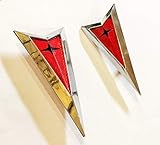
That distinction matters: a documented historical association is not the same as a verified explanation for every design detail. Claims that the star represents a particular tribe, direction, or value should not be treated as established without a primary source.
How the imagery evolved
1920s: Chief Pontiac becomes part of the brand
Art historian Mona Hadler writes that Chief Pontiac’s name was aligned with the automobile in 1926, when General Motors copyrighted a coin depicting the Chief with the words “Chief of the Sixes.” His head also appeared on radiator caps during the 1920s. Hadler describes the figure as a source for more than 40 different mascots between 1926 and 1955; that is her reported count, not a separately verified GM tally. Hadler’s 2010 SCA Journal article traces the early imagery and its later forms.
#1 Best Overall
Early 1930s: the head-in-a-ring design
Hadler describes early-1930s Indian-head-in-a-ring designs as a prototype for Pontiac advertising imagery. The profile and headdress carried the established association with Chief Pontiac, but the emblem developed alongside other uses of the figure rather than appearing as one unchanged logo.
1935: a portrait presented to Pontiac Motor Division
The Pontiac Transportation Museum records a separate event: the City of Pontiac commissioned artist Jerry Farnsworth to paint a portrait of Chief Pontiac and presented it to Pontiac Motor Division in 1935. This civic gift is not evidence that Farnsworth’s portrait was the company’s official logo. The museum’s account describes the portrait’s origins.
1930s to 1950s: hood ornaments take on a jet-age look
Pontiac’s sculptural ornaments changed in material and shape. Hadler describes red copper-plated head ornaments with trailing feathers, followed by illuminated red or amber plastic inserts. Later “flying chief” designs blended the face with airplane-like forms. Her analysis connects those streamlined shapes to the era’s fascination with aircraft, speed, and modern industrial design.
By 1956: the mascot era gives way
Hadler places the end of the mascot era by 1956, describing how the Chief’s face was replaced by a plane-like nose. This marks a transition in the hood ornament’s form, not necessarily a single, documented date for every change in Pontiac’s broader branding.
Quick wins for a faster PC:
Scan for outdated or missing drivers - takes under a minuteDriver Scan →Clear out junk files and repair common Windows errorsFree Scan →1959: the arrowhead and star
A secondary account by SlashGear reports that Pontiac unveiled the downward-pointing arrowhead and four-pointed star known as the “Dart” in 1959. The date is reported by that source; the materials considered here do not include a primary GM design brief confirming the rollout or assigning a fixed symbolic meaning to the emblem’s details. SlashGear’s 2022 history is the source for this chronology.
Chief Pontiac’s portrait, mascot, and badge are not interchangeable
Several related images are easy to conflate: the Chief Pontiac portrait given to the division in 1935, the profile used on radiator caps and ornaments, and the later arrowhead badge. They belong to the same broad brand history, but they are different objects and uses. The museum’s account establishes the portrait’s civic origin, while Hadler documents the changing ornaments and early branding. Neither source makes the 1935 painting the official emblem.
Rank #4

- Pontiac G8 Front emblem
- This emblem is flat 1/8" thick, sticks to flat surfaces. Automotive grade plastic
- Measurements: 1.9" w x 4.3" h x 1/8" thick
- comes with 3m double sided tape
- Laser engraved plastic with layer of brushed aluminum on top.
What the imagery meant—and how it is read today
The head and headdress drew on Native American identity to make the Pontiac name visually legible. Hadler’s scholarly interpretation places the ornaments within postwar consumer culture and argues that they combined a stereotyped Native American image with corporate power and the period’s fascination with aviation, speed, and chrome. That is an art-historical analysis of the imagery and its cultural context, not a statement of GM’s formally documented intent.
Seen in that context, the mascots were not merely decorative objects. They turned a complex Native American identity into a polished corporate symbol for cars and advertising. The arrowhead moved Pontiac toward a geometric mark, but its existence does not resolve the cultural questions raised by the earlier imagery—or establish what GM intended each later detail to signify.
What’s actually slowing this PC down?
Pick the symptom - the matching free tool is one click away.
Best Value

- Sticker Color: Gloss Black
- Fits: 2004-2008 Pontiac Grand Prix (not for GXP models)
- Sticker. Sized and designed to to stick onto to the red section of the EXISTING, factory front Arrowhead. The actual emblem is NOT included
- Includes 2 Arrowhead Decals [1 plus an extra] & Installation Instructions
- Official GM Licensed Product
How the two main design eras differ
| Feature | Chief imagery and ornaments | Arrowhead and star |
|---|---|---|
| Subject | A profile associated with Chief Pontiac, often shown with a headdress or feathers | A downward-pointing arrowhead with a four-pointed star |
| Typical form and placement | Sculptural radiator-cap and hood ornaments, alongside advertising imagery | A geometric badge and printed emblem |
| Visual language | Figurative and three-dimensional; later ornaments incorporated streamlined, aircraft-like shapes | Abstract and geometric |
| What the sources establish | Hadler documents the historical association and changing mascot forms | SlashGear reports the 1959 introduction; a definitive GM explanation of the star and colors is not established in the sources cited here |
Sources and limits of the record
Hadler’s 2010 article in the SCA Journal, hosted by the CUNY Graduate Center, is the strongest source cited here for the mascot chronology and cultural interpretation. The Pontiac Transportation Museum’s September 9, 2019 account documents the 1935 portrait. SlashGear’s October 31, 2022 article is a secondary source for the reported 1959 Dart introduction. GM’s Heritage Archive describes the company’s historical collections, but does not itself settle the arrowhead’s symbolism. No primary GM design brief establishing the star’s intended meaning is cited here.
Quick Recap
Product prices and availability are accurate as of the date/time indicated and are subject to change. Any price and availability information displayed on Amazon at the time of purchase will apply.